My Expectations for MAIN in The Future
Based on the comparison of Facebook, Ecency, and MAIN, these are my personal future expectations for MAIN. Why the comparison between Facebook, Mastodon, and Ecency? That's because I use them. Facebook is a centralized social network, whereas Mastodon, Ecency and MAIN are decentralized social networks. That is, I am contrasting centralized and decentralized social networks.
1. New User Profile Interface With Cover/Banner.
The star icon on the left allows people to follow others and have interaction, even if they are not friends, but they can't connect in the chat room.
+ button on the right corner allows people to add someone as their friend.
The "Chat" button below the "+" button allows people who are friends to interact in the chat room.
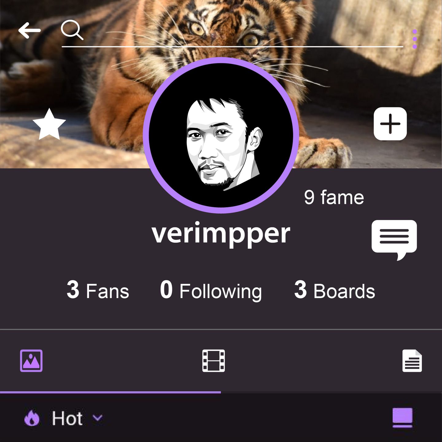
On the profile page, there are three icons: image, video, and blog article that can be accessed by friends or other MAIN users to view the collection, depending on the privacy setting.
2. Have a Chat Room or Inbox.
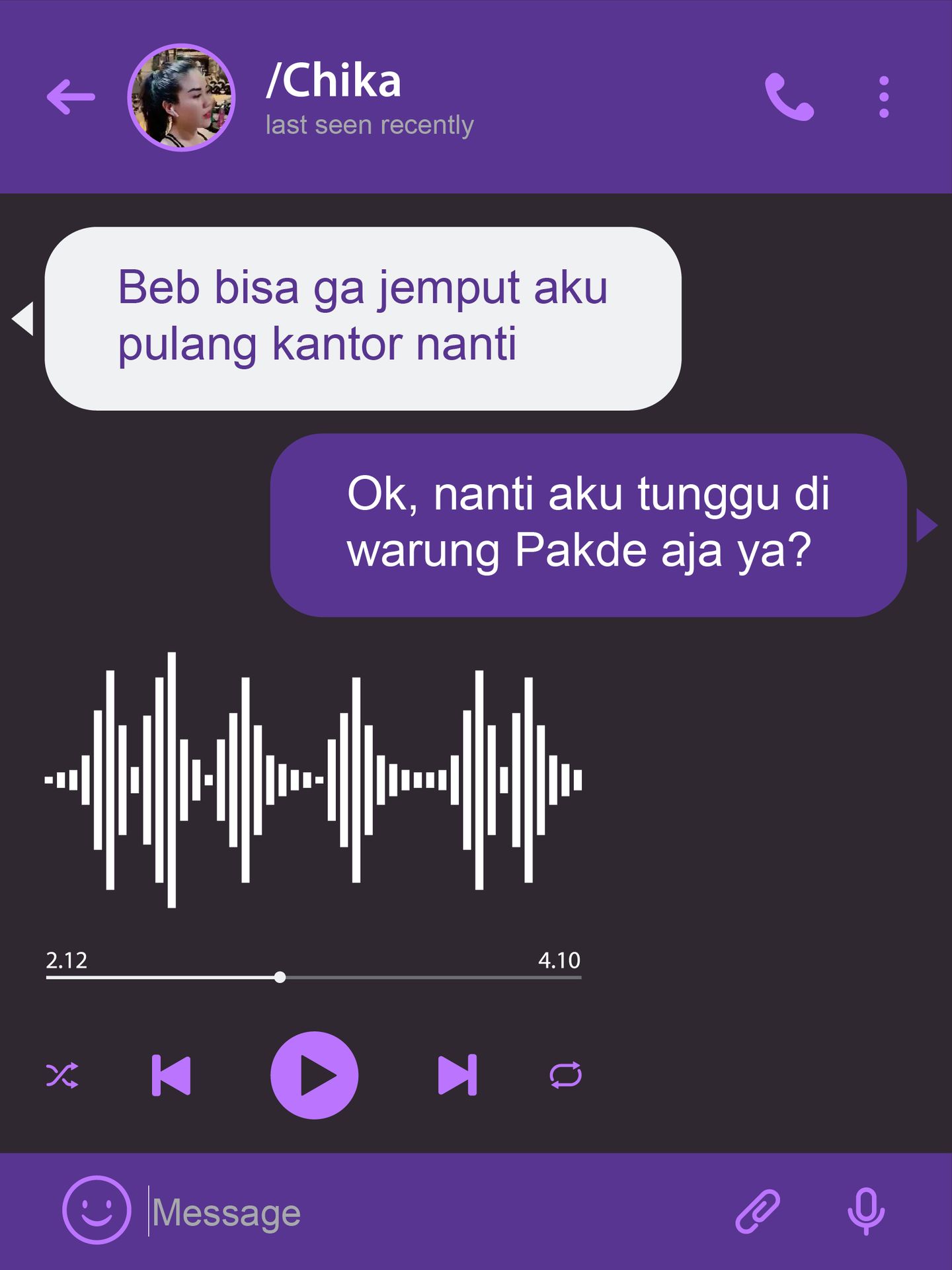
3. Live Streaming, Video or Sound, Just Like a Podcast.
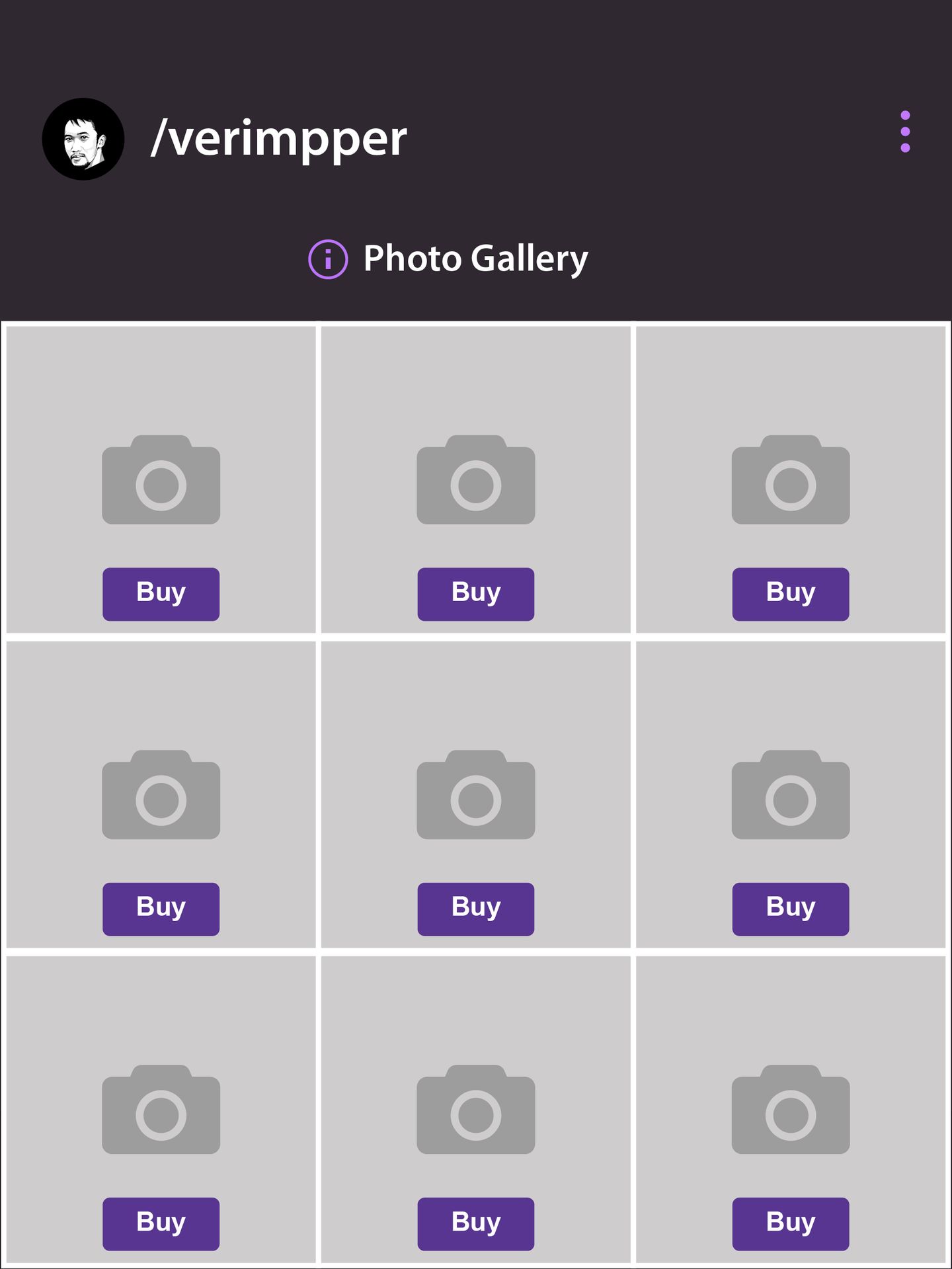
4. An Image or Video in the Gallery, Which Can be Sold as NFTs.
5. Unlimited Words for Articles with Professional Blog Tools.
Recently, MAIN only allows users to write in 6000 characters. Facebook can do more than 6000 characters. Ecency known better than Mastodon, MAIN and Facebook for recently in writing article.
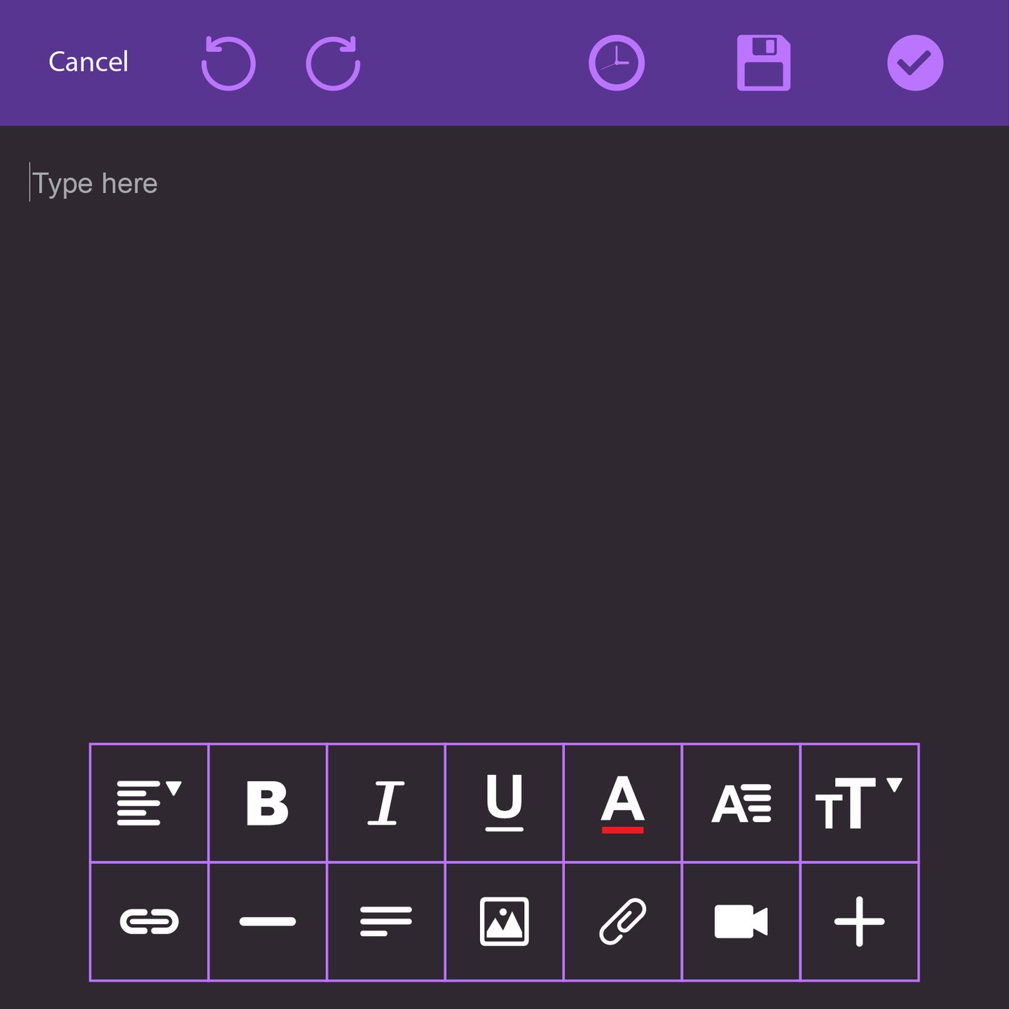
I hope there are professional blog tools like paragraph style, align left, align right, and justify available. Text color, markdown, tables, footnotes, etc. Ecency made a good effort on this.
6. A Collection of Images and Videos, Each With a Hashtag and a Short Caption.
I have Instagram experience here on MAIN with their multiple image features, but it's a shame that MAIN limited their users to uploading only 6. It would be great if users could upload images, limited to 9 or 10 images.
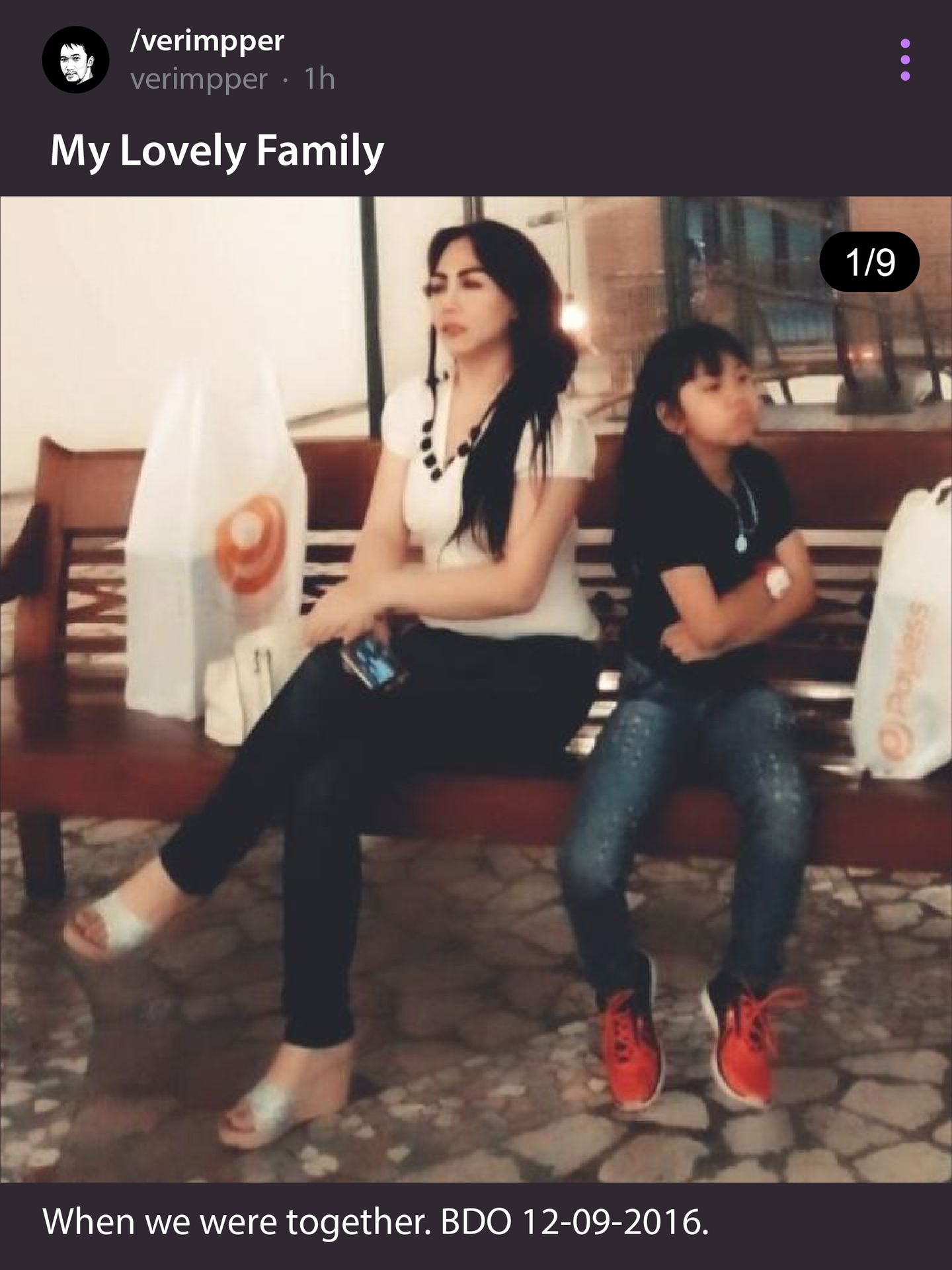
Sometimes people upload images or videos that are not owned by them, but they put the credits of the owner. Sometimes I do that too, but in MAIN, how can people explain the image or video they upload if there is no field to put the caption? MAIN should consider this.
7. Always Have Options for Users.
People will be able to choose the layout of photos and videos before they upload them. single-continuous view or grid view.
8. Privacy Settings.
Users have the right to decide who can see their post and who can download their image or video. Who can comment on their post, etc. Many decentralized social networks ignore privacy. Users can see almost everything about other users in the name of transparency while disregarding privacy. The privacy settings, the most important things, aren't available yet on MAIN.
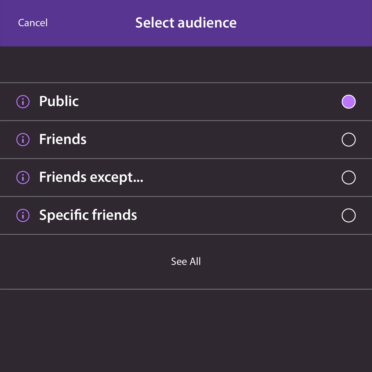
Facebook is still number one in privacy. That's why I'm still using it even though I didn't like it so much.
There should be an on/off button related to sensitive content (sexually explicit and violent media) on MAIN.
9. Estimated Token/Coin Value.
It would be great if the MAIN app and mobile web version had an estimated value in users' local currencies. recently, only available on the website version.
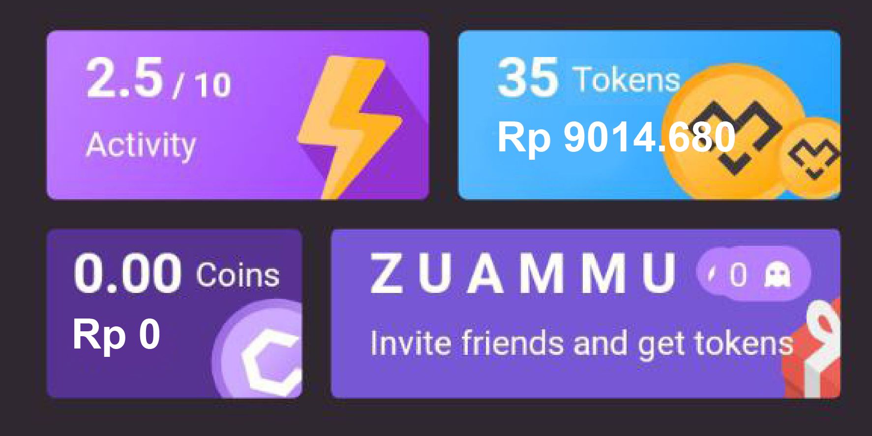
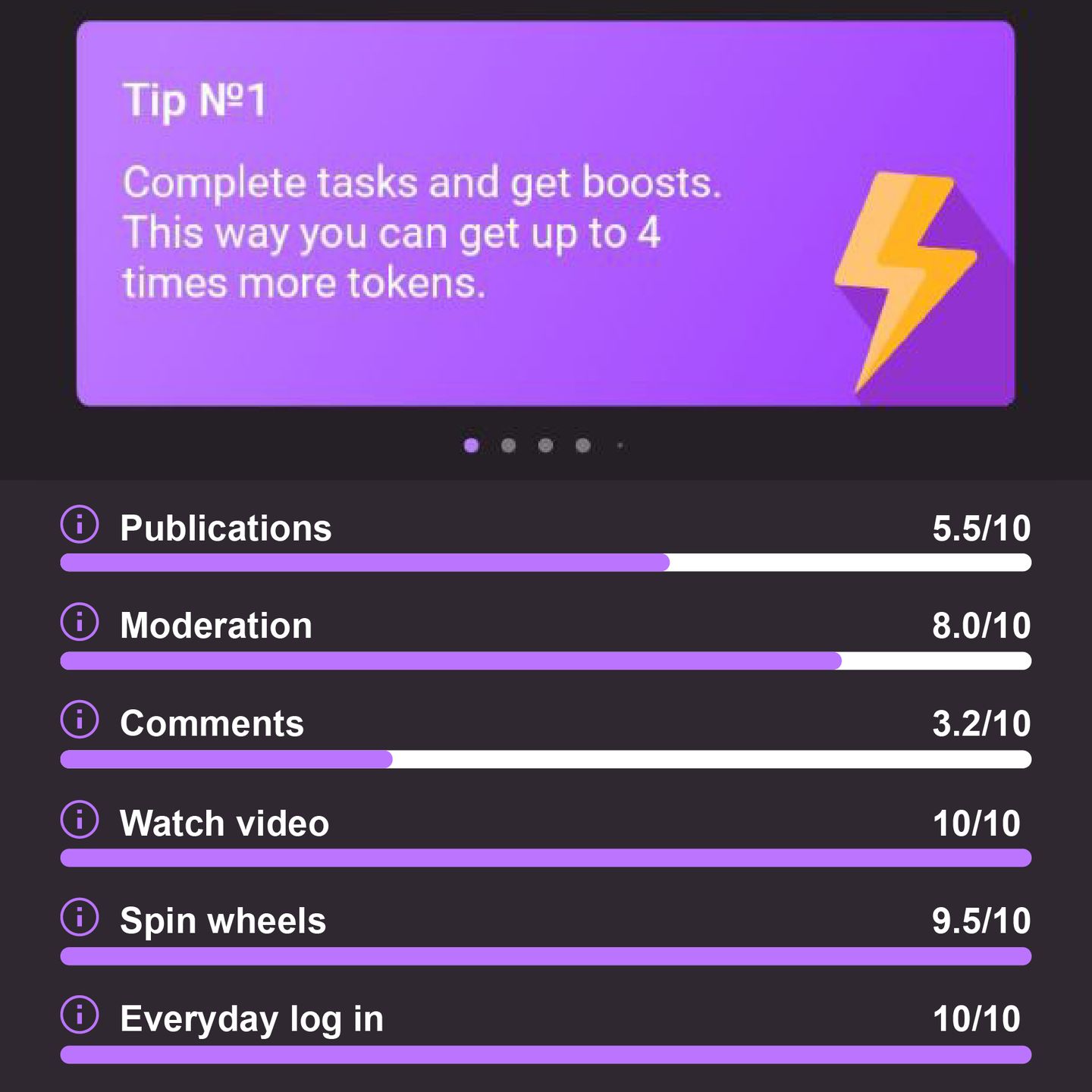
10. More Tasks.
Staking, cloud mining, MAIN event, giveaway etc.
11. Rich Post Options.
Anonymous polling, sound (sound recording or Mp3)
Multiple file uploads (photo + video + gif animation).
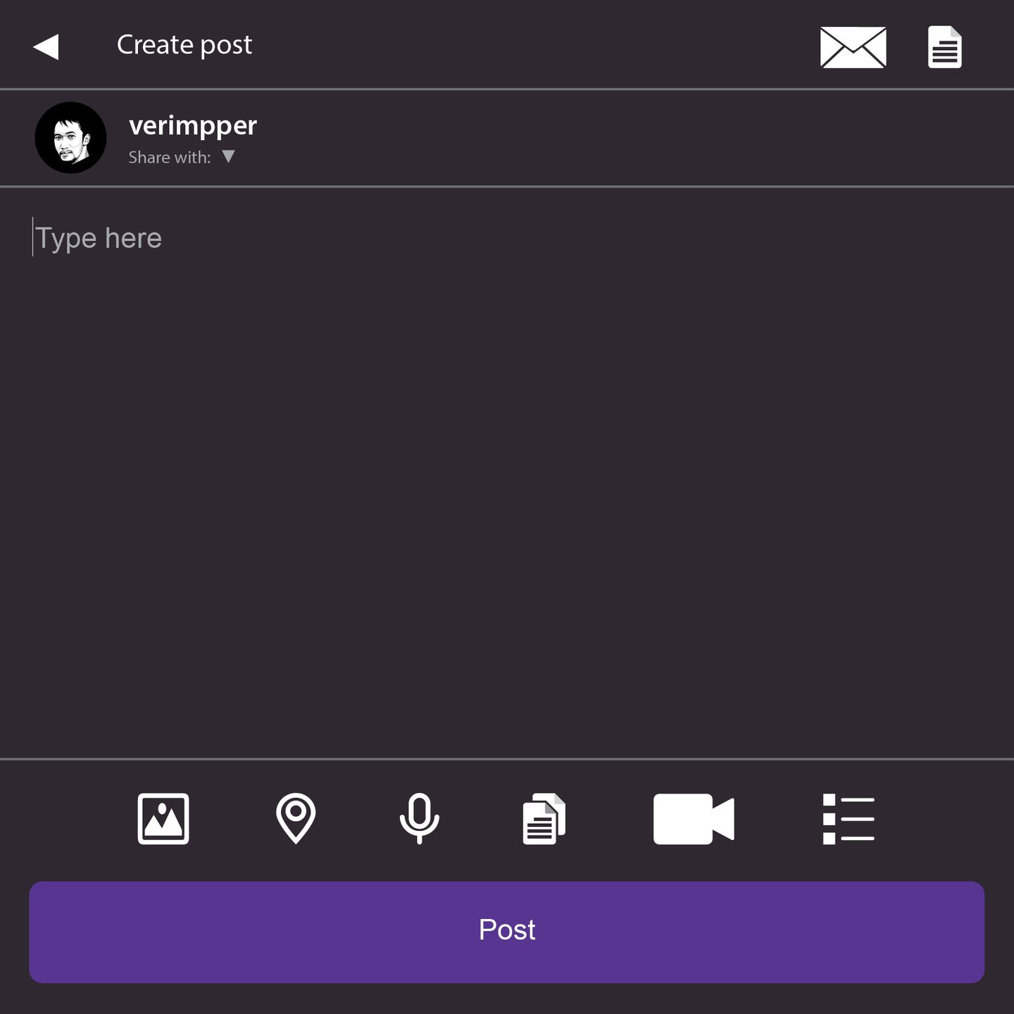
You can see two icons in the top right corner. The article icon is to write an article, and the email icon means users can write an email and send it from this platform. In the meantime, at the bottom, you can see 6 icons. From left to right, the image icon indicates that you can upload an image from your gallery or camera, the location icon indicates that you want to share your location, the microphone icon indicates that you can share your sound, voice, or MP3, and the multiple file icon indicates that you can upload an image, video, and location in a single post.
12. Image and Video Width Fit on Screen.
It would be great if this platform used fit-on-screen view for images and videos to have the best and maximum image view. Recently, MAIN has had an annoying border of empty space on the left and right side of the image and video.
On MAIN, an image or video will expand to fit on the screen when you tap the image or video.
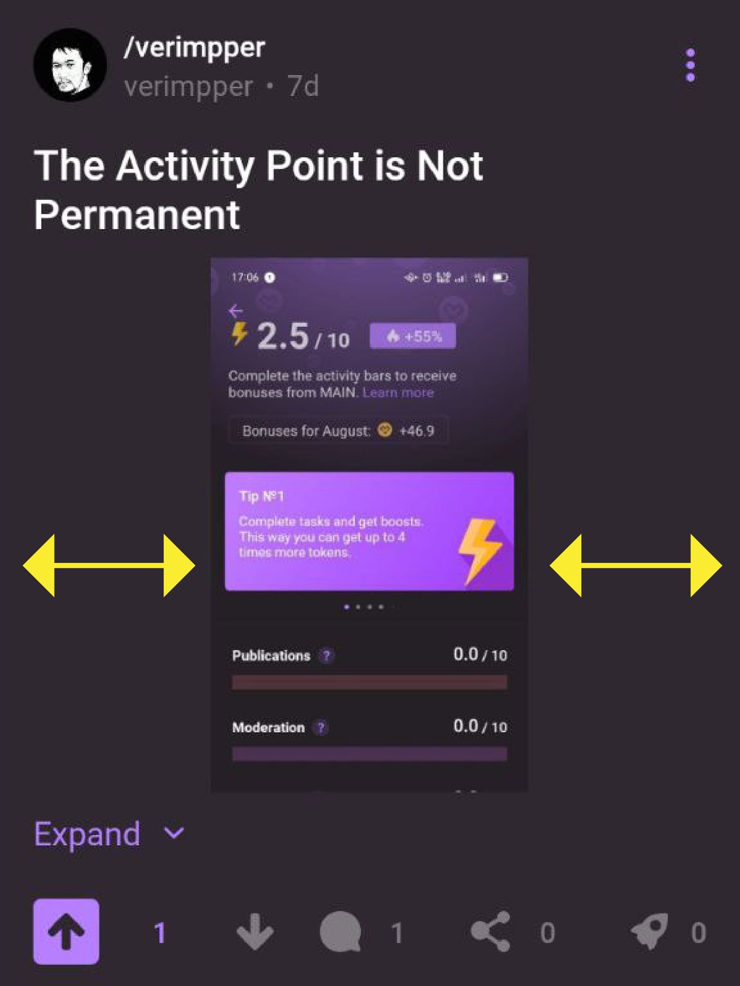
This is what I mean. See on the right and left side of the picture. That's what I call the "border" or empty space between the images and videos.
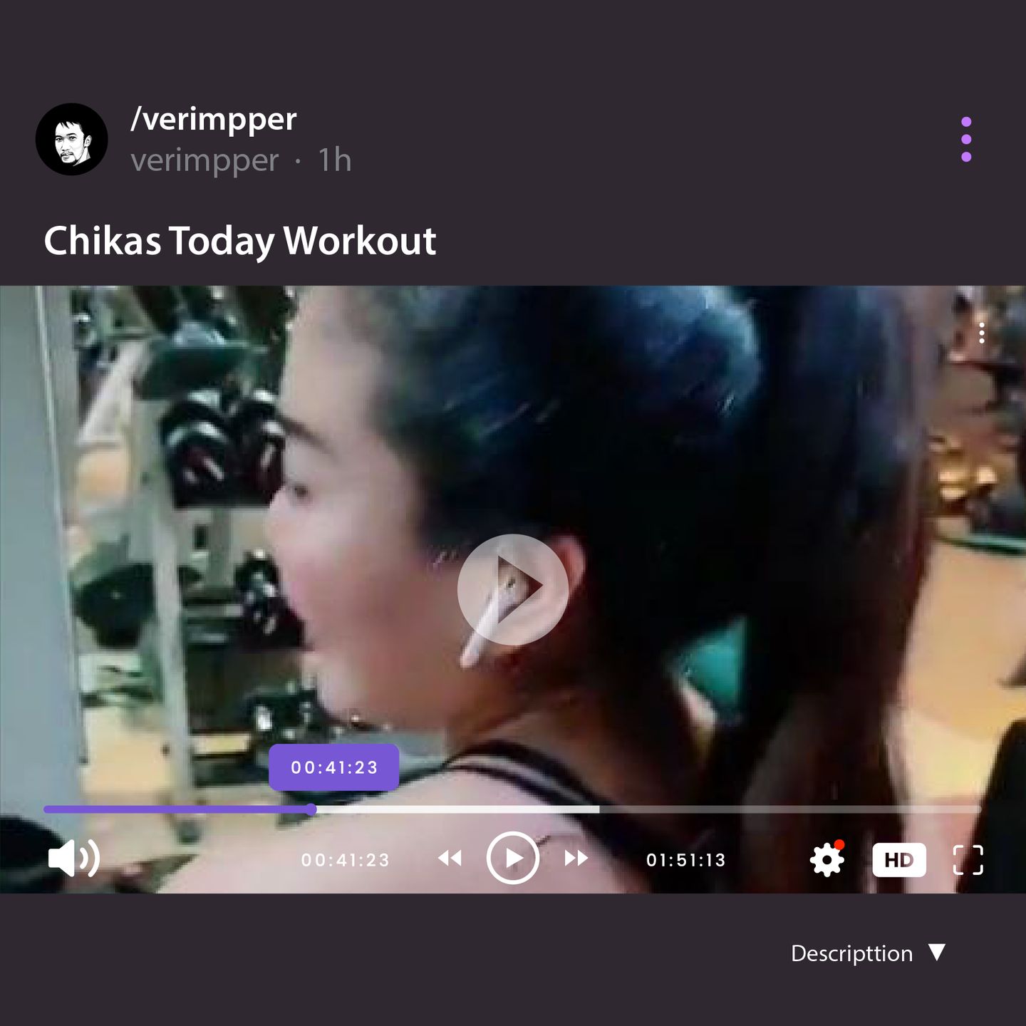
The image preview will be good in square (1:1) and will expand the height when we tap the image.
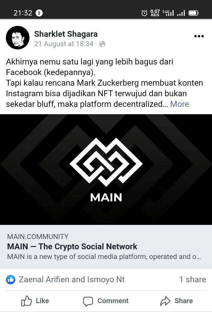
Not only images and videos should fit on screen, but link previews should as well. This is an example, the screenshot of a link shared on Facebook, which has a good preview.
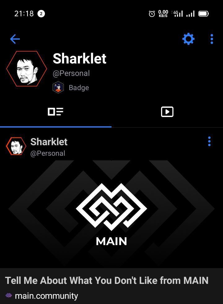
Link share on Uhive also have a good preview.
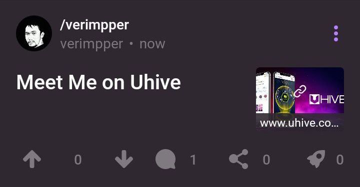
And this is a screenshot of a link preview from MAIN. I think the preview is too bad, too small to see. It looks great on mobile web browsers such as Google and Opera, but not in the app and website versions.
Overall, Mastodon has the perfect visual experience of the content (image, video, link, etc.) rather than Facebook, Ecency, and MAIN.
13. Language Translations.
14. Monetising Article(s) and Video(s).
15. Search Field on The Boards.

The search field will be the easiest way to find something rather than scrolling down.
10 comments